.
Ritual is the transcendence of function to the level of a meaningful act.
Public architecture at its best aspires to be just this: a setting for ritual that makes of each user, for a brief moment, a larger person than he or she is in daily life, filling each one with the pride of belonging.
Spiro Kostof, A History of Architecture
.
Preliminary
I have taught college English for over thirty years at eight different schools. Add my own education and most of my life has been spent in an educational institution of some sort. With the schools’ programs comes their architecture, their buildings, their classrooms, the designs and functions of those. Little has left a lasting impression and most has diminished what should be a memorable experience.
Most schools where I’ve taught have been places of division and isolation, both physically and psychologically. There are few places for informal gathering, while departmental and administrative conflicts make interchange difficult. Disciplines and governance are kept separate without meaningful integration, even without casual personal contact. Their architecture itself often exerts mass control, based on hierarchies that lack vital priorities, on a process divorced from real purpose. Their design is simplistic and standardized, if not sterile. Everything looks the same, making a walk across campus monotonous.
So I thought I’d try to design my own school. This is a conceptual study, really a diversion, and a great many details have not been worked out. One consideration that needs to be made in any effort to start afresh is why good ideas often go wrong, and mine may well prove to be no exception. Any plan must not only be grounded in a substantial set of ideas but also tested by extensive use and practice.
My general plan is for a modest community college, with thought to expense and basic needs. Its design should be distinctive but also stand up to the wear of heavy use and time, as well as to the constraints of strained budgets, a perennial concern. But I’d also like to use it as a starting point to redesign postsecondary education itself as well as provide a center for the larger community around it, thus recreating it as well.
For a site, I’m using Silicon Valley, where I’ve lived and taught most of my career. It is a place with almost no historical landmarks, few buildings of age or distinction, and only faint traces of an architectural heritage, largely a few modernized versions of the Mission Revival Style. The land is essentially flat and developed, with little area where the natural environment has remained. There are almost no cultural outlets nearby, few convenient places to gather, and little to attract people of diverse interests and talents as might be found in a school. In effect, it is a blank slate, like much of our suburban landscape throughout the U.S., a place to start over and try to make something stick.
And rebuilding Silicon Valley is the first priority. Few students and teachers can afford to live close to the places where they learn and teach.
I’m dreaming, of course. Another study would be of the forces in play that keep good ideas from coming to light.
.
First Construction: A Multiple Use Center
.
A building type is an architectural form that is invented for a specific purpose and achieves a general validity, both visual and ritual, through its repeated use.
Kostof
.
“We don’t create spaces on campus where faculty can talk about teaching and learn from each other,” a community college vice president told me recently.
Cited in Mike Rose, Back to School:
Why Everyone Deserves A Second Chance at Education
.
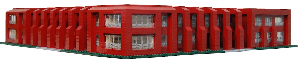
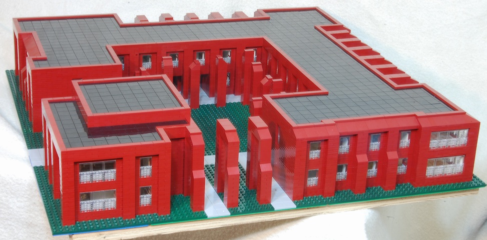
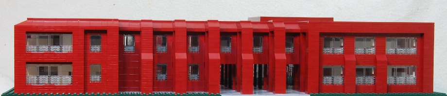
This building would be one of several similar spread throughout the campus to break down the hierarchy of school planning, these surrounded by classroom clusters. There would be no large open spaces, which tend to be imposing and are seldom used. Traffic, instead of being channeled down major thoroughfares, would be dispersed throughout the campus, which might help reduce noise and the anonymity of large groups in motion. Landscaping is assumed throughout, which would provide the real esthetic interest of the school as well as break up open space and provide shade for comfort and help cut air conditioning costs. In fact I would get rid of air conditioning, as it is not needed in this area, and just add a little heat for winter. All the systems I have endured are horribly inefficient and ineffective. Every window should have some kind of view other than bare, open space or another window. And every window could be opened to let in air.
It is my first effort, and I question the regularity of a square building with the rooms aligned down a central corridor. My other thought is of a design where the offices are broken up in a loose maze-like construction, extended throughout the campus, which I may attempt later.
The second floor would have faculty offices, the square rooms in the diagram below, about 10 x 10 feet each. Faculty should enjoy some remove from campus distractions but not be distant from its functions and activity. On the three corners are three open rooms, about 17 x 17 feet, at the intersection of the halls. They could serve a variety of purposes—student conferences, informal meetings, or just a place to sit and eat lunch with others. I suggest offices come from two or three departments to allow some contact and discussion between disciplines.
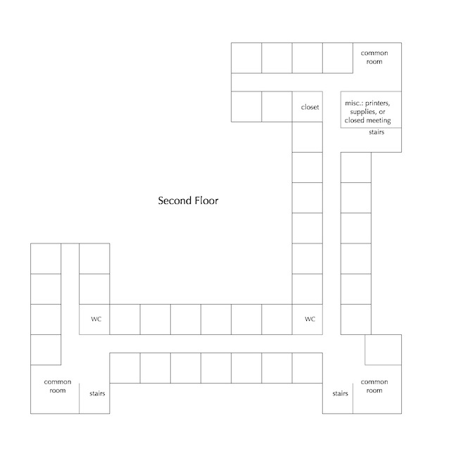
Not quite to scale or proportion.
Click on this and all images to enlarge.
If this center were ever built, it would be an interesting study to find out how these rooms are actually used—or why they are avoided. Much could be learned about department dynamics.
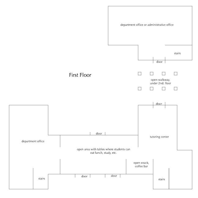
The first floor could hold two departments, as marked, or a department and some administrative function, even the president’s office, or a counseling center. A tutoring center would be in one corner, next to an open space near the doors, with tables where students could study or just hang out before class and eat themselves. A snack/coffee bar could be added as well as other services to keep everyone from wandering all over campus for simple needs. Since the building is small, about 128 x 128 feet, noise and traffic would be minimized. With a variety of school employees constantly present, security and general care could be informally maintained.
Note the doors and stairs. In such a plan, everyone comes into contact with each other, if only in passing. Faculty pass by students in the tutoring area, as well as through a department. Administrators are kept close to both.
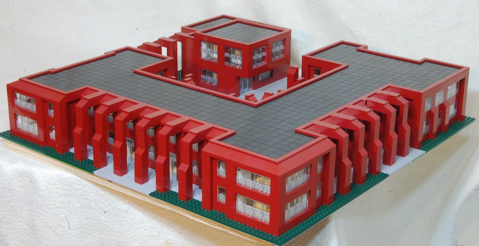
The small corner building could house an art gallery or some similar exhibition space on the first floor, perhaps incorporated with a small information center to draw more use. There are windows on all sides to allow a view of an exhibition as people walk by. On the top floor is a largish room that should seat about 40, which could be used for lectures, readings, or other gatherings. Attendees would pass first through the gallery, thus have additional exposure to an exhibition. It might also host events that would draw residents of the surrounding community.
One precedent is MIT’s Building 20, a rough, hurried construction built during World War II and allowed to stand after the war to handle the rush of veterans returning to school. Its design was illogical and haphazard, as it developed quickly to meet a variety of pressing needs. It not only housed several different scientific disciplines, but also was the first site for the newly formed Linguistic Department—and Noam Chomsky—as well as student clubs.
http://libraries.mit.edu/archives/mithistory/building20/index.html
From Jonah Lehrer, “Groupthink,” The New Yorker 5/19/13:
Building 20 became a strange, chaotic domain, full of groups who had been thrown together by chance and who knew little about one another’s work. And yet, by the time it was finally demolished, in 1998, Building 20 had become a legend of innovation, widely regarded as one of the most creative spaces in the world.
The space also forced solitary scientists to mix and mingle.
The building’s horizontal layout also spurred interaction. Brand quotes Henry Zimmerman, an electrical engineer who worked there for years: “In a vertical layout with small floors, there is less research variety on each floor. Chance meetings in an elevator tend to terminate in the lobby, whereas chance meetings in a corridor tended to lead to technical discussions.” The urban theorist Jane Jacobs described such incidental conversations as “knowledge spillovers.”
http://www.newyorker.com/reporting/2012/01/30/120130fa_fact_lehrer?currentPage=all
Convert several rooms to classrooms, and the building could hold a small college.
Or this could be the plan for a neighborhood center, cultural and governmental.
.
Design
.
In their stark abstraction, they remind of of the primary urge in all architecture, the struggle to stand up against the pull of gravity.
Kostof, speaking of the Stone Age dolmens found in France
.
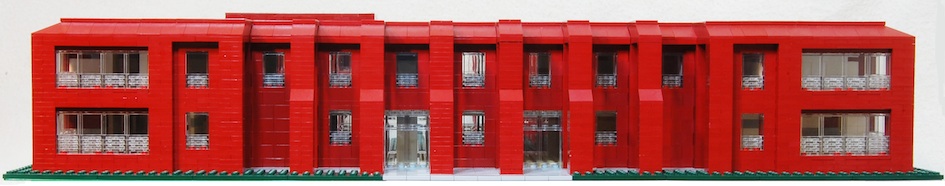
My design is conservative and somewhat traditional, though I have tried to make it distinctive and expressive, while at the same time I have kept an eye on a budget.
Recent architecture has been the locus, if not a battleground, of many debates of old against new, tradition against the modern, postmodern against modern. I would hope my building continued that debate without resolving it. But many modern buildings I’ve seen in common use are merely modernistic, reduced expressions, simplifications without character, while older buildings have a character, through architectural detail and materials, that has endured. Many architects push expression to the limits. Gehry’s Ray and Maria Stata Center replaced Building 20 at MIT and provides one example:
http://web.mit.edu/facilities/construction/completed/stata.html
Northside Middle School, in Columbia, Indiana, provides two terms for the debate. The first building, by Harry Weese, 1961, is made of brick throughout and is square with a courtyard, like mine. It is a modest, yet tasteful and affordable, construction that has stood up well. Next to it a recent modern addition by Leers & Weinzapfel:
http://52weeks.rickyberkey.org/2011/01/09/week-2/
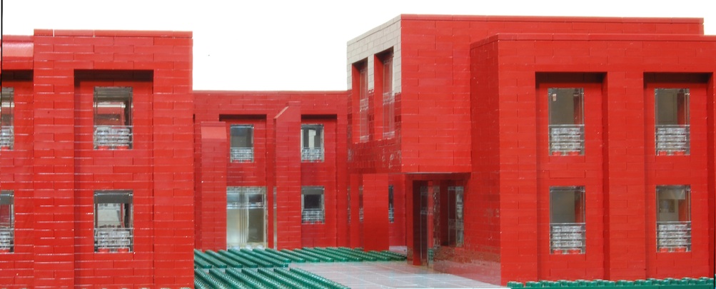
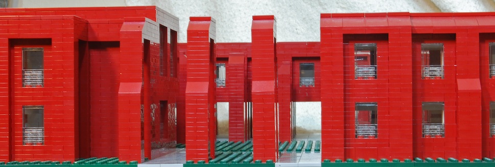
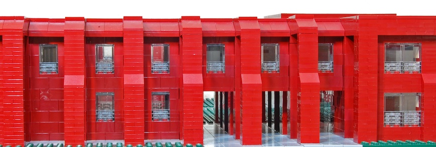
Materials and details matter. All surfaces would be faced in brick, rough textured, of a deep red color. This building material is not commonly used in California and it is not cheap. I must confess a bias for the older buildings I grew up with in the East, which still remain with me. I especially have Jefferson’s University of Virginia in mind, but even old simple brick factories have lasting appeal. A solid brick wall has more character and warmth than one faced with stucco or concrete, both of whose abstract cleanness deteriorates over time. Brick should prove durable and retain its face over many years, as well as reduce maintenance costs. I would also want solid, well-designed fixtures throughout.
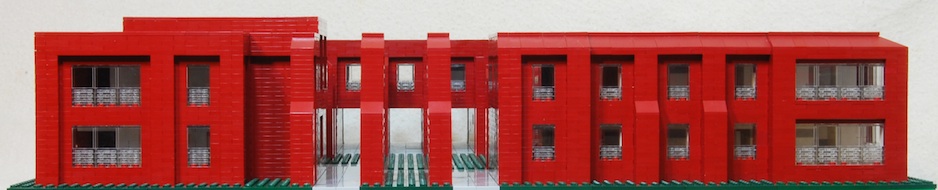
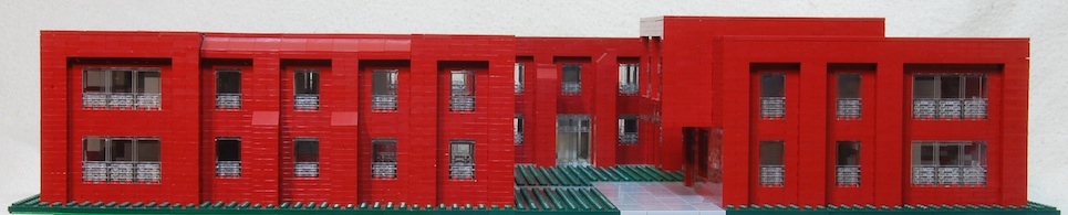
Each side of the building is different with only one of them symmetrical, providing variety and perhaps aiding in identification of function, at any rate breaking up monotony.
Building around a courtyard has a tradition that reaches back to Mesopotamian times. Alvar Aalto’s Saynatsalo Town Hall is a modern example:
http://www.greatbuildings.com/buildings/Saynatsalo_Town_Hall.html
http://en.wikiarquitectura.com/index.php/Saynatsalo’s_Town_Hall
to which Harry Weese paid tribute in his Oak Park Village Hall:
http://chicagomodern.wordpress.com/2012/04/24/oak-park-village-hall-learning-from-saynatsalo/
Such a design solves a practical problem of giving each room light and air, a window with a view. I left the courtyard with a lawn, but there is room for a garden or several small trees.
My building is open at one corner, providing a dialog within the whole building that I’d want to maintain throughout the campus, of closure and openness, privacy and public exposure, containment and unboxing.
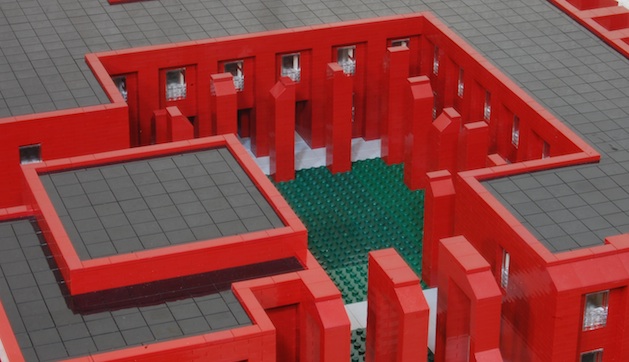
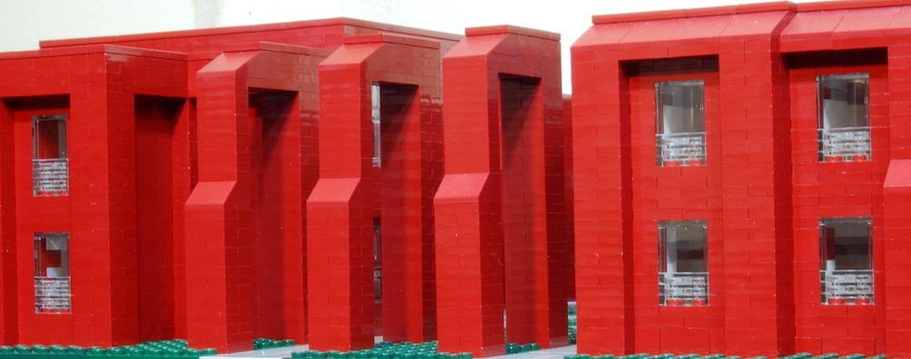
The columns on the exterior may be excessive. I have to work within the units Lego allows. But I like them a great deal. They suggest flying buttresses, though they serve no structural purpose and support nothing. Nor did I add a ceiling to protect from the rain. Rather, I wanted to keep them open, allowing a complex interchange of light and shadows. The columns in the courtyard serve no function whatsoever, though lamps could be put at the top to light it at night. They suggest vaguely any number of constructions from the past, the upright stones of dolmens or Stonehenge, a deconstructed monastic cloister, or whatever interpretation one might want to give. Their varied sizes might suggest a variety of distinct parts making a whole, or the individuals who make a community. Like the exterior columns, they will produce a variety of shadows, marking the passing of time throughout the day, the changing seasons.
.
Notes on the Model
The model is built with parts from the recent Lego architectural series, a significant cause of my inspiration for this project. The model fits within a 2 x 2 foot square, with a scale of 1/64. Proportions are close but not exact. The pieces do impose some limits, especially as to size, and limit architectural detail. Still, I think the pieces offer great possibilities for preliminary designs.
.
.